In 2014 Google launched material design.
The purpose was to create a design system with a set of principles, guidelines, and components for designing consistent and intuitive UIs.
Material design defined how elements like buttons, cards, typography, animations, and layout should look and behave.
And as it became popular, a growing need for libraries to create React-based web applications based on the newly born system, rapidly emerged.
Material UI was born (MUI).
What is MUI?
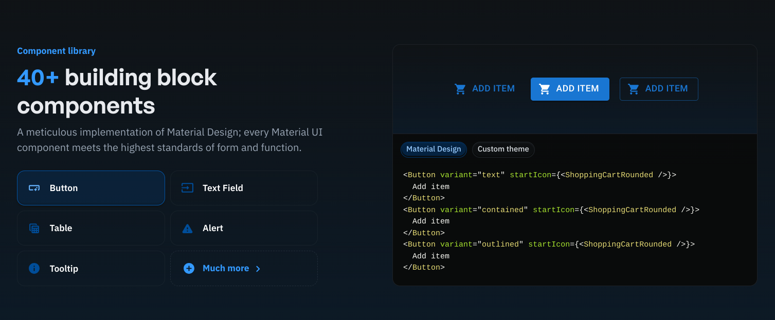
MUI codified the visual elements of a web interface in code, enabling developers to build the UI directly into the code base without any need for a designer or a visual editor.
As MUI and React moved in parallel, this new way of building web application not only secured a higher level of standardization but promised to developers to access a varied list of building blocks they could pick to assemble the UI themselves.
As the concept gained a following, some have used MUI to assemble large production-grade React applications (including BBC, Grafana and others) and the market for React libraries that skip the design phase through a fixed global design system suddenly boomed.
Here you will find 3 alternatives to MUI.
Ant Design: The Enterprise Choice
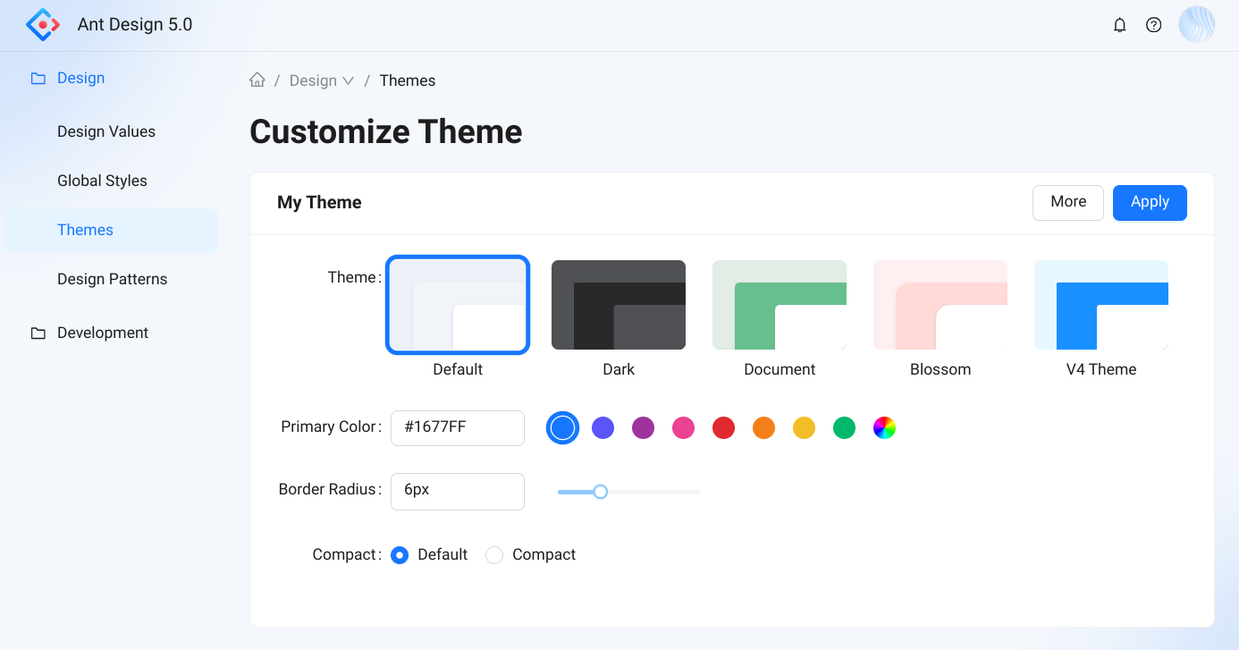
As the self-proclaimed world's second most popular React UI library, Ant Design positions itself as a comprehensive UI library primarily designed for enterprise-level applications.
It provides a large set of components with a clean and minimalist design language.
Users on Reddit seem to highlight some challenges related to the library's flexibility, even though there are a few popular use cases of platforms built using the tool (as Xiaomi's website, Snapchat and more).
It is clear that Ant design presents an opportunity for data-heavy interfaces with a very sleek and minimal interface.
Chakra UI: Accessibility and Great DX
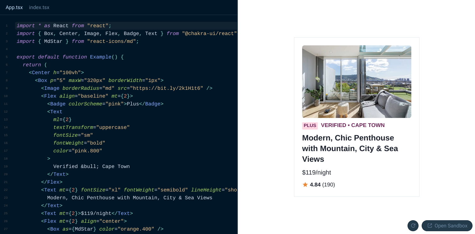
Chakra UI is a simple, modular, and accessible component library for React. It focuses on the developer experience, ease of use, and accessibility.
It comes with built-in support for accessibility standards (ARIA) and components are easy to assemble and style using its styled-system-based approach.
Lightweight and highly customizable with minimal overhead, Chakra UI is the right choice to ship fast without added complexity.
Radix UI: Maximum Flexibility
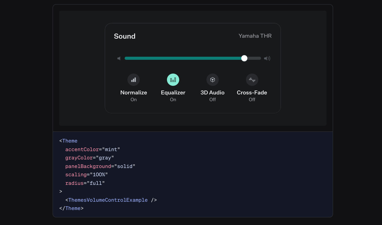
Radix UI is a library of unstyled, accessible components designed for building user interfaces in React applications.
It aims to provide developers with a set of low-level building blocks that can be styled and customized according to specific design needs, while ensuring high accessibility standards.
The lack of styling seems to add complexity but can be overcome mixing Radix Ui with Tailwind CSS quick styling (as shown here, on SW Habitation).
Is material design the answer?
As shown in all the cases above, material design speeds up significantly the GTM for software products, particularly when the resources on the design side are not available.
However, when the product will mature and require a solid design, it is highly probable a visual editor (and the design process involved with it) will render obsolete the code used to speed things up.
This is why we created Polipo, a Figma plugin that makes it easier to create starting from a Figma design, using React, Next.js, Vue.js, Angular and other technologies to render dynamically the visual elements of a web app.
More stability for building long lasting apps, with code.
Would you like to explore this road?
Start here.