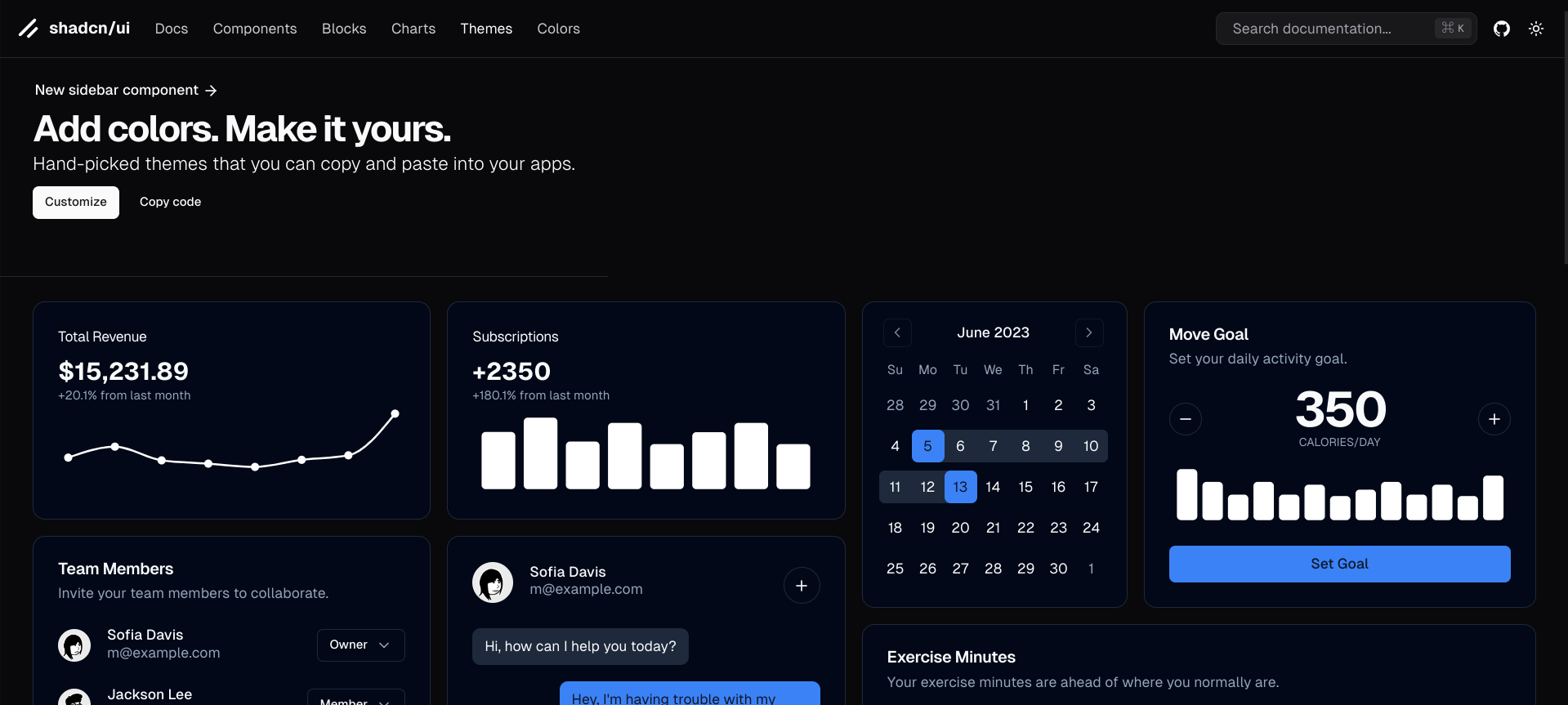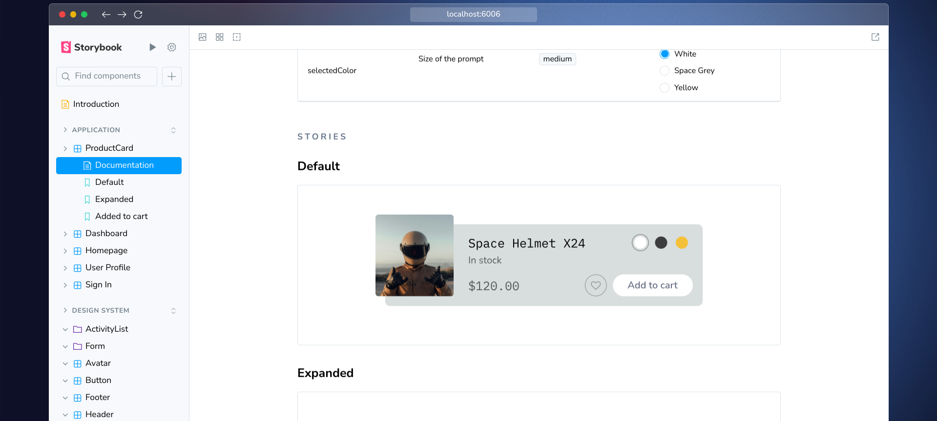
We wrote this guide to show you how to set up both Shadcn UI and Storybook to create UI components.
What is Shadcn UI?

As already covered in our blog, Shadcn UI is a modern component library built with Tailwind CSS, offering a collection of customizable and reusable UI components.
Why Use Storybook?

Storybook is an open-source environment to create, test, and document UI components in isolation.
This means you can develop components without the need to run the entire application every time.
Setting Up Storybook with Shadcn UI
Step 1: Create a New Next.js Project
First, set up a new Next.js project (you can use other Frameworks as well). You can do this by running:
npx create-next-app@latest my-project
cd my-project
Step 2: Install Shadcn UI
Next, install Shadcn UI:
npx shadcn-ui@latest initStep 3: Install Storybook
Then, Storybook:
npx storybook@latest initThe previous two steps configure both Shadcn and Storybook detecting your project type (with all the dependencies and needed files).
Step 4: Configure Tailwind CSS for Storybook
Import in your .storybook/preview.js file:
import 'tailwindcss/tailwind.css';
Now Tailwind styles will be available.
Step 5: Create Your First Component
Let's create a simple button component using Shadcn UI. For example, a file named Button.tsx in your src/components/ui directory:
import React from 'react';

export const Button = ({ children }) => {
  return (
    <button className="bg-blue-500 text-white px-4 py-2 rounded">
      {children}
    </button>
  );
};
Step 6: Write Stories for Your Component
Now that you have your button component, create a story file named Button.stories.tsx in the src/stories directory:
import { Button } from '../components/ui/Button';
import type { Meta, Story } from '@storybook/react';

const meta: Meta<typeof Button> = {
  title: 'Example/Button',
  component: Button,
};

export default meta;

const Template: Story<{ children: string }> = (args) => <Button {...args} />;

export const Primary = Template.bind({});
Primary.args = {
  children: 'Primary Button',
};
This code defines a story for the Button component, so you can see how it renders with different props.
Step 7: Run Storybook
You can now run Storybook to see your component in action:
npm run storybookOpen http://localhost:6006 in your browser to view the Storybook interface, where you can interact with your button component.
Best Practices for Using Shadcn and Storybook

- Document All Components: Ensure every component has corresponding stories that demonstrate its various states and props. This documentation is invaluable for team members who will use these components later.
- Use addons: Leverage addons like Controls and Actions to make your stories interactive. This allows you to test different props dynamically within the Storybook interface.
- Visual Regression Testing: Consider integrating visual regression testing tools like Lost Pixel to ensure visual consistency across updates. This is particularly important as your component library grows.
- Keep Components Isolated: Always develop components in isolation to avoid dependencies on other parts of the application. This makes all the work reusable and easier to maintain.
Faster than a component library?

Polipo let you write your own source code while rendering any Figma design in real time.
No AI generated stuff.
Feel like trying it?
Start playing.